
Designing The Resistance
A Case Study for Crafting the Empire State Indivisible Brand Identity

If you’ve been following US politics lately, you’ve likely heard of the Indivisible Guide, and the many local Indivisible chapters that have sprung up through its instruction. If you’ve been poking around in New York City and State politics lately, you may have noticed a new player on the block. That’s us, Empire State Indivisible.
I’ve been a participant for a few months now, and recently helped the group launch a new brand identity. Here’s how it happened.
Out With the Old … Sort Of
In branding terms, this isn’t a pure before-and-after. Instead, it’s more like a spin-off. NY Indivisible, the mothership org where we originated, popped up around the time of Trump’s inauguration, and over the course of several months, we found a routine in our role as a scrappy grassroots gang of organizers. We met in church basements, made phone calls, wrote letters, posted about events on social media, snapped photos with officials, signed petitions, and more. It’s all simple stuff, but that’s what works!
But after some months of this, the founder of NY Indivisible wanted to change the role of the group, and transition into more of a technology platform connecting statewide groups, not just focusing on week-to-week issues affecting New York City and State. This was, frankly, a minority view, and the rest of us wanted to stay the course as an Indivisible group and follow the methods laid out in the Guide. So it was determined that we’d have a sort of “conscious uncoupling”, where we could create a new group alongside NY Indivisible, and slowly, purposefully, redirect awareness there.
It was less of a long goodbye, and more like getting dumped. The transition pushed up to “now” and we needed a new identity fill the void.

The Group So Nice They Named It Twice Within a Year
Fortunately, we knew the split was coming so there was some time to create a name for the new group. The obvious ones jumped to mind: Gotham, Five Boroughs, NYC, Big Apple, etc. but due to their unavailability, clunkiness, or narrow focus on New York City only — not to mention the potential confusion with the remaining NY Indivisible — we decided to go with Empire State Indivisible. This reflects a new sense of outreach to other Indivisible groups around the state, as well as a focus on the IDC and other Albany happenings that have a direct and shocking effect on residents of New York City.
The Brief and Early Days
It was at this point Heather and Michael, two of the group’s leaders, reached out to me to see if I’d be interested in helping to rebrand the group. Having helped them a few weeks prior with a promo graphic for one of our town halls, they knew I did graphics, but I don’t think it was clear that a project like this — full on identity update — is right up my alley.
[Prescott] understood the inherent power of how a brand can carry the source, cause, and origin of a group into the world. Even though we were headed into uncertain times, I was at ease knowing he was helping us with this key next step.
— Heather Stewart, Empire State Indivisible
Michael had written a brief and pulled a few images, but in this case we all knew the story — there was no regional vice president of internal development providing deep insight into an obscure marketplace, or some consultant revealing years of consumer research. Nor was this a heady advertising pitch where we’d have to build layers of desire and subliminal emotion on top of something mundane like insurance or ketchup. Simply, the group needed a new visual identity to match the new name, and it has to work on all the things, especially social media and digital applications.
version 0.0
Because of this new urgency, I found myself in a new situation, tasked with providing a “placeholder” identity so we could put something on our website, newsletter, and social feeds to separate us from NY Indivisible. The real one would take time, but we need something now.
This is an interesting prospect. My first instinct was to create an obviously plain solution — a grey-and-beige Helvetica version where everything looks typed, but not at all designed. Almost like a wireframe of an identity, viewers can tell something is coming, but it’s completely uncelebrated and dull-on-purpose. The problem with this approach is that folks will think this is our new identity, and will start to treat it as such. To the viewing public, a logo is a logo and an avatar is an avatar. Aside from an actual Twitter egg — which would have made us look like a Russian spam bot — recognition would build immediately.
To that end, we decided that even for this placeholder version of the identity — what we called “v0.0” — we should use similar colours to what we propose, and try to select a typeface that might embody our values as a group. We wouldn’t, for example, go with some spraypaint font or make it look like Blade Runner just because it’s “cool.” We’re still pros, after all.

I literally thumbed through my font library in Suitcase Fusion and selected something that worked, exported a few different arrangements of the wordmark (stacked, horizontal, with tagline, etc.), and called it done. I also made up an icon of the Empire State Building using only a few lines of the same weight. This served as the avatar on Facebook and Twitter, and became quite popular almost immediately.
The urgency wasn’t only coming from our social media scrambling; I knew that the longer the placeholder identity stayed in use, the more people would perceive it simply as the finished work, and our genuine v1.0 rebrand would feel like a hasty version 2.
But that doesn’t mean we can skip steps or do a crummy job! There’s enough of that in the world, clearly.
Research, Imagery, and Planning
Moving swiftly but purposefully, we returned to the brief, which was fairly open-ended in terms of visual inspiration and starting points. Still, it felt natural and appropriate to stay reasonably close home, taking inspiration from NYC itself, and from our legacy of people-driven and public-sector graphic design.
Aside from landmarks like the Statue of Liberty, Brooklyn Bridge, NY State House in Albany, Empire State Building, and few other bits around the state, there isn’t any single symbol that feels essential to New York. (I’m thinking of The St. Louis Arch for Missouri, or an Alligator for Florida.) The State’s crest is a bit intricate for a modern identity, I couldn’t tell you what the state bird is, and anything to do with actual apples is a non-starter, if only because Washington State produces more.

The State Flag of New York is Navy blue with tan and gold elements. That of the City adds Orange (a reference to our Dutch roots, and why we see it in use for the Knicks, Mets, Islanders, for example.) New York doesn’t have an immediate association with material or texture, the way we might use denim and leather for Texas, or timber for Oregon, etc., but we did examine architecture and public art as a source of inspiration.
Specifically, in our minds, this means early 20th century styles of Art Nouveau and Art Deco, which help make up the urban environment in NYC. We see this in building façades, transport infrastructure, gates and handrails, pedestrian parks, statues, wayfinding, and even manhole covers. It’s everywhere if you look. When creating an identity for anything vaguely based on New York City, it’s worth a thought.

Another element to explore and mine for ideas is sports — baseball in particular. New York State is home to the Baseball Hall of Fame, and NYC itself is the ancestral home to four of the Major Leagues teams, including the Yankees, one of the most recognised sports brands in the world. The fact that you can still buy Brooklyn Dodgers merchandise 60 years after their move to LA says there’s something here! On a practical level, baseball shows us strong use of colour, contrast, icons, patterns, and how to deploy each across a range of merchandise and applications.
There’s also a rich landscape within the political sector itself. Candidates now must take on larger, more professional branding endeavors, but so must causes and non-profit orgs across every ideology and function. Inspired by recent talks at the Brand New Conference showcasing the ACLU, Black Lives Matter, and Clinton 2016 identities, it felt like time to get moving.

Concepts and Presentation
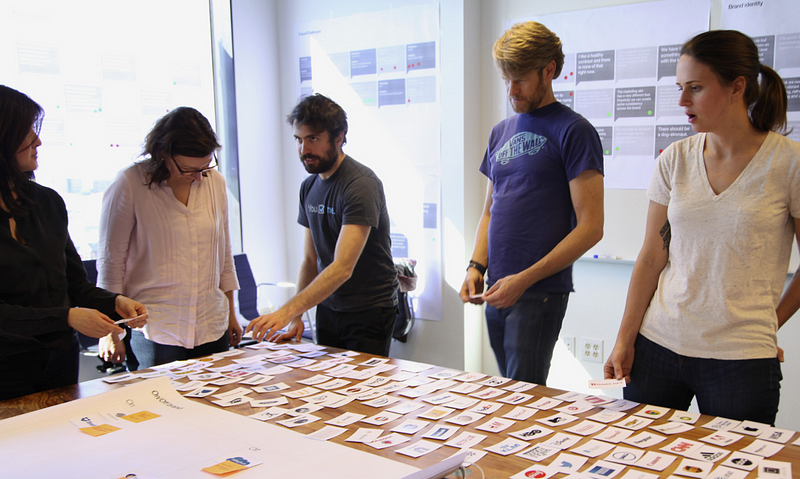
My design process is pretty straightforward. I distill the core values and brand attributes into very succinct words or phrases that I can fit on a Post-It. Then, armed with that punchlist, I sit down to sketch. After filling 1–2 pages — yep, that’s it — I’m usually able to see 3–5 approaches emerge. These all still need a ton of work, but already I’m allowing myself to come up with distinct ideas and to be surprised by what suddenly connects when pencil hits paper. That’s what I did here.
Four Approaches
Before I officially sat down to sketch, there had been a wee bit of chatter, often in the form of “wouldn’t it be cool if …” or, when taking a look at an inspiration image, someone might remark “something like this” in a non-instructive way. In my own mind I had already been designing a little, which I know is a bad habit for logos/identities because sometimes it simply doesn’t work out on the page.

The first idea was to somehow use the letters ESI to create a stacked initial wordmark, referencing the architectural order of the City. When set in a wide typeface, E and I are very even and structural, and of course the S can be drawn with lengthy flat sections on top and bottom. But when it all came together, this just couldn’t work out. It felt forced. The letters were illegible and otherwise just looked off. This didn’t have the iconic quality I had hoped for, so I moved on.
A good practice when designing identities is to take at least one approach that is fairly predictable or safe — something to ground the wilder ideas which may follow. In the case of a political organisation, that usually means a wordmark-only approach. The downside to this is that designers are faced with the challenge of either searching endlessly for just the right typeface to suit the brand, or to mint one fresh. Being the masochist, of course I chose to build one custom.

A few sittings in Illustrator yielded half an alphabet, and an arrangement that felt more appropriate for the group. Less Soviet-feeling than the placeholder logo, more forceful than Helvetica and its cousins. For the first presentation, though, it was left unfinished. I happily admit my inability to create an entire typeface from scratch in a matter of days. Still, the concept was proven and presented — this was indeed an option.
The second option was an expansion of the torch icon previously used for NY Indivisible. But instead of the stumpy trapezoid with a squiggle of flame (scroll up to the start if you don’t believe me), this version would celebrate the torch much more, and the illustration style would leave no doubt it was Lady Liberty’s torch, not just something vaguely resistance-y. At this early stage, we experimented with a few different type styles, and adjusted the relative size and line-weight of the torch to match.

An additional concept was taken from the visual research into the aesthetic of baseball. With the intention of standing out rather than blending in, the idea of a script wordmark emerged. Something that looks full of life, energy, and motion, but also carries a sense of the personal. This isn’t meant to look “typed out”, but rather “hand-crafted.” The challenge, though, was to steer clear of pastische approaches, and anything that literally feels like it might be stitched onto a rec-league softball jersey. For the presentation stage, this was left imperfect.

The final option was the weird one. Here, the logo isn’t a logo per se, but this idea of using different hands in great variety. Each hand can represent a different function of the group, or a different region of New York. The origin of it all came from the simple open hand showing five fingers for five boroughs and the closed fist to unite them to a common purpose. A bit of experimenting and suddenly we’ve got ways to represent Upstate, Erie, and Finger Lakes regions of New York, as well as Long Island and the City. Common hand gestures can be mapped onto different concepts such as march, call, rock, peace, vote, and more.

We would need a wordmark to match, but that’s really secondary for this approach (for now.)
Heather, Michael, and I sat down on a Sunday afternoon in Michael’s office in midtown. Despite the informal relationship, I felt it was important to present “in the room” as opposed to simply sending off a PDF via email, or even screen-sharing on a conference call. In-person presentations add that extra bit of theatre to the affair, and allow us the designers to see client reactions in real-time, and in real life.
I walked them through my work so far — framing the problem, visual research, ideation, four identity approaches.
The choice was clear — the hands concepts! The modular idea took hold immediately, and the overall idea of hands felt very human, something personal where we could enroll others in the effort. Even the expressions “join hands” or “helping hand” imply a combined effort and general optimism of pursuit.
Michael and I were blown away with that first presentation. It was like seeing this visually layered interpretation of our hopes and dreams for this group.
— Heather Stewart, Empire State Indivisible
Second Presentation & Rollout
With a chosen direction, the next move was to refine it. Work began on the hands themselves, finding (or creating) a typeface to match, expanding the applications to really show how it might work in practice, and generally moving it forward toward being a practical, viable identity.
Hands Illustration Refinement
Just as I was diving in to fix up these hands, I noticed a few other identities in the wild using hands or fists. Indivisible Harlem, for one, used three raised fists as their principal icon. We also spotted a one-off t-shirt making use of the fist, and even a modular hands-focused identity for Springster that was featured on Brand New.

The tactics might have to change — not to abandom the hand concept entirely, but to change the role. The hands and fists can remain part of the identity, but perhaps it’s best if they weren’t the focus of the logo in the same way that other groups are using it.

With this in mind, there was still plenty of refining to be done. For a start, there was a challenge of how to make our hand drawings unique. Humans have been drawing and tracing hands since the dawn of time, but here I’m faced with making them interesting for a 21st Century audience.
The one I mocked up in presentation felt a bit 70s — big beefy digits and a palm made of circles gave it a playful look which didn’t quite suit our group and the tone of voice we’d created for ourselves. A full pendulum swing led me down a path where most everything was made of 90- and 45-degree angles, and the fist appeared somewhat pixelated. Some further iteration led me to use both right angles and curves — some corners are rounded, others are left sharp. This creates a playful sense of dischordance, and makes it unique to us. Additionally, the hands aren’t closed shapes, but rather several line segments. This allows some play with the segment terminations, in our case, square. The viewer’s eye can fill in the rest, but it helps add dimension and interest.

Testing these at different sizes helped refine the “natural” line weight for the hand outlines, especially for the fist. I knew that this one would sneak its way into a great many of our pieces.
This logo meant so much to our group, the stakes felt very high going into this, and I worried before we started the journey that we’d never agree on something we all loved, much less quickly, but we did.
— Heather Stewart, Empire State Indivisible
With the fist taking shape, the challenge now was in creating a series of hands based on the same line weights and style. We needed multiple hands not only to represent the regions of New York, but to serve as icons and symbols for our communications going forward. Instead of illustrated elements, we’ll use the hands. These are what allow us to grab attention and have a little fun. But of course that means more work for me in Illustrator.
The system unfolded as you might expect. Started with the fist, still working in pure lines, and expanded that to an open hand. Right there that’s two quick variants with the thumb, and when you start folding down two or three fingers, it all starts to develop quickly. Next thing you know, we’ve got quite a few hands to represent the different concepts at work.

It wasn’t all smooth sailing, of course. Some of the hands simply looked weird, and required some optical-illusion work to extend or shorten the fingers as needed. It may not be anatomically accurate, but to complete each illustration, liberties are taken. For example, the “call” arrangement — the pinky and thumb extended — feels rather like the “hang loose” symbol. We’ve done some work since, but that’s a tough one.
Custom Type
At the same time I was building the hands, I was thinking about type to match. Revisiting some of the art deco-inspired type and source elements, I put together something that felt like us. Sharp, sturdy, not too dainty, and where the type’s personality wouldn’t overpower the rest of the piece on which it would eventually be featured. That happened pretty swiftly, actually, because of the particular letters needed to spell Empire State Indivisible — and in upper case only — thankfully I wasn’t confronted with the challenge of crafting a full alphabet just yet.

But having refined the hands to feature both sharp angles and curved elements, the type had to follow suit. While this didn’t affect letters like the capital I or T, it opened the door for experimentation with curved letters like P, B, and R as well as those which could use curves, like M, N, and V. The S is a nightmare of its own! In some typefaces its the curviest letter, and the only one not to be built from 90-degree angles.

I’d like to maintain the illusion that I was very systematic in varying all the letters, and testing each one against its rivals in some great matrix. You can imagine a scene in a lusty design studio where dozens, if not hundreds, of single characters are printed out and pasted on white walls, with a savvy squad of designers comparing each and marking things up with red pen. Nope, it was just me. I would make some changes, print it out and different sizes (essentially: small, medium, and large, but all fitting on a standard sheet of US Letter paper), and then looking at it for a while, both up close and from across my office (slash bedroom).
One trick I did employ, which I recommend, is to print the logo backwards and/or upside down. Look at it this way and observe the mark solely as a symbol. You won’t be able to read it, exactly, but you’ll be able to see what areas feel congested or empty, what letterforms don’t seem to fit, and whether or not a certain piece is distracting.
Even with this refinement, it didn’t have to be perfect. There was still another presentation to build and the slight chance that it would all be scrapped. The v0.0 placeholder identity was still in use at this point.
Graphic Style and Type Selection
Modern identities are more than just logos. The supporting type hierarchy, colour system, graphic devices, layout styles, and all the surrounding pieces matter greatly, in many cases more than the logo itself.
Crafting the graphic style was really a recipe of three parts. First, the colours. From our research and discussions, we decided to use navy, with some kind of gold or tan, and introduce a different blue that wasn’t pure Royal blue like we’d see in use for the Democrats more broadly.
After some experimenting to find shades that work well with one another, the colours fell into place. Two blues, Navy and Steel, two warm brownish hues, Sand and Tan, and orange as an accent, specifically two oranges, Dark and Bright.

Second is the type. We could very easily have lost ourselves in searching for typefaces to use, but in the spirit of not reinventing the wheel, I went with a legible, approachable, timeless selection: Futura. This specific cut, Futura PT, is available through Adobe Typekit, meaning it will sync across computers of anyone with Adobe CC, and frankly, most people with a modern install of Mac or Windows can dig up a version of Future that can substitute. That’s the practical side, but of course Futura is an appropriate creative choice too.

Futura has a lengthy history of public sector design. It’s been around since the 20s, used in both Europe and America, but when the Nazis decided against Futura for their print communications, it was scooped up by the Yanks and used to great effect for New Deal, WWII, and Space Race-era applications. The strengths then are the strengths now — it’s clean, simple, easy to read, translates well to scale, comes in multiple weights, and carries an enduring sense of modernity and straightforward communication, even after nearly 100 years of use.
The limitation to Futura, though, is that it’s not much of a text font. It’s better suited for posters, headlines, and short, punchy captions, rather than long passages of type, even when reduced in size. I personally feel it looks better set in all-caps, which amplifies the need for a companion font. Again, I turned to Typekit to find a contemporary serif type family which works well on the web and print, which has a few essential weights and variants (e.g. bold, italic, and bold italic), and which pairs nicely with Futura. Once again, the testing process was fairly unscientific — printed out a few passages of dummy text, at different sizes, with some Futura subheads lumped in for contrast. Made the decision to go with Adelle PE.

Thinking ahead to possible issues with Adobe Typekit and licensing, or more likely, with accessing Adobe CC, I thought it a prudent move to identity some Google Fonts which can serve as understudies, and fill in when the first choice isn’t available. Substitutes for Futura and Adelle were found in Poppins and Arvo, respectively.
We’ve got colour and type. Now, the third component is the layout style and graphic devices. Even with the many hands available, a full system of colours to choose from, and typefaces chosen, it felt like we needed something else. At first I tried slices of the hands icons in the background, forming abstract shapes, but found those too distracting. There was some additional experimentation with dots, underlines, and flag-like devices hanging from the top of each image or page, but in the end I settled on a simple solid outline. This adds a supporting colour to each image, and helps the piece feel finished and contained. An outline does introduce a disadvantage in that it shrinks the size of the effective piece, but when repeated across a wide variety of imagery, the positive result is increased recognition and familiarity. Folks can identify an Empire State Indivisible image at a glance, without reading it, thanks to the combination of graphics, colours, icons, and type.

There’s one more element to consider at this point: patterns. There’s tremendous strength in branded patterns to support the rest of the identity, and to use for backgrounds, website graphics, and other less obvious places. These patterns add some visual intrigue and texture to break up the solids. In our case, lacking a photo library and relying largely on a type-only system, the patterns can play a fun role in helping bring the system to life.
There’s really no end to the number of patterns we can create, especially if we’re varying colour combinations. Repeating the hands or fists is an obvious approach, one that works without any “decoding.” Another result we like is when the hands and fist icons are blown apart, and reassembled as a jumble of abstract shapes. With the same line weight and angles of our hands icons, they seems to fit, even if the meaning is obscured.
Executing these meant some time poking and nudging in Illustrator. A low-contrast colour execution is a must, ensuring we can use these as background imagery without interfering with text legibility.

Making It So
So often with identities, we designers spend most of our energy in the concept and creative phase, with hardly anything left in the tank to put it all in production. In the agency world, this might be the time to hand-off to an in-house team or share down to more junior staff who may not have been involved with the client presentations, but in this case, those scenarios don’t apply. It was go-time from the beginning.
Social Media
Even before it was finished, with all parts and pieces accounted for, the new identity was headed for public view. On social media, that meant staking a claim to the appropriate handles and getting and avatars and backgrounds in place.
We had registered the social media usernames months earlier, when it was known that NY Indivisible was about to eject us. We updated the avatars to make use of the v0.0 identity, and updated them again almost immediately after presentation and approval.
Because I had previously set up a comprehensive social media backgrounds document in InDesign, I was able to generate the images while maintaining my sanity. Using a consistent orange-on-navy colour scheme for the fist icon avatar, the social accounts all look cohesive, even with some variation with the background patterns or images.

But social media isn’t just a place to stash the odd quote and ism, it’s our main communication method! We had to move immediately into promoting upcoming events, meetings, and calls-to-action based on the topic of the day.
Our social media presence has a huge impact on our success, both our perceived success by the outside world, and our actual measurable success, as a group. To this day, our social media identity is among the most professional and visually stunning of any Indivisible group, and I include the national team in this comparison.
— Heather Stewart, Empire State Indivisible
The trick online lately is how to keep people interested. I think we’ve all followed brands, candidates, or causes that mean well, but after a while just wear us out. In this case, the challenge is how to get folks to read the actual copy — event details, action steps, other important info — and do something about it.
To break up the monotomy, we decided to vary the colours used in our images. Rotating through a few colour combinations would not only expand our visual identity in the mind of our followers (e.g. “I could tell it was Empire State Indivisible without even reading it.”), but it would allow us to break the pattern when the situation called for it. Starting with our two blue-on-blue schemes, we also created a white template and a Stone one with Tan highlights. Those four would give way to a striking orange colour scheme. This version, which we dubbed the “orange ticket” after NYC’s parking tickets, would grab attention and force the reader to pause for a moment. We reserve this colour scheme only for the most important action items — to date we’ve only used it twice.

The above images are samples, but show our layout style, hierarchy of type, use of colour, and overall approach to content. The image will only contain so much information, keeping it rather generic and succinct, and the post itself will have the details on places, times, what to wear, bring, do, etc., along with appropriate hashtags.
When we introduce ourselves at events, people instantly know our group, often holding up a fist to imitate our logo, or directly remarking on how our visual identity and voice stand out on their social media feeds.
— Shannon Stagman, Empire State Indivisible
We had to be systematic here. I created an InDesign file with the most pertinent social media image sizes (Facebook timeline, Facebook event, Twitter timeline, Instagram, and general use), and duplicated the same pages across multiple spreads, each using a different colour combination. With this, I’m able to generate multiple images to share online in a hurry! After all, life moves pretty fast.

Imagery aside, it also presented a challenge regarding workflow. What’s the correct way to have multiple people decide on messaging, write copy, craft appropriate images, and publish to the various outlets? I’m not sure if I’ve seen a perfect method executed, especially when folks aren’t in the same room. Because we’re all doing this outside of our main thing, there are a lot of moving parts coming together at once. But so far, it’s holding.

Beyond this initial scramble in the weeks following the new identity, we’re now asking larger questions about social media. It’s not sustainable that I’m the only person who can make these images, or who has access to the hands icons and template files. The first step to remedying this is to create a proper style guide, with image assets and design guidelines, where people can follow my lead. We’ll also need to build some human and software systems to track this all, and to ensure that the “go-ahead” gets given, and there are systems for approval and review.
It’s funny, these images are, literally, small artifacts. No single JPG is going to move mountains, but without these larger systems in place, we’re setting ourselves up for chaos. Even the best identity is useless without some means of being effectively used.
Printed Matter
In spite of our modern times, and the budgetary constraints of being a scrappy grassroots org, we did put together some print projects in the early days.

Following the success of the NY Indivisible-branded bookmarks from a few months early, we reprinted new ones, updated with new logos, colours, and typefaces. We also took the opportunity to update the Who Represents Me side to include a lookup URL and our updated social handles.
“Congresswoman Maloney (NY-12) took the bookmark and studied it. Suddenly she got it, and expressed that the idea and execution was genius. She also expressed that ESI is doing amazing work and is force to reckoned with in NY.”
— Danielle Brecker, Empire State Indivisible

We chased the bookmarks with business cards, done with identical methods and paper stock. Used the same printer too — PixelPrint out of Long Island.
After attending a few other rallies and events across the city, we discuss the idea of printing buttons to serve both as a fundraising effort and a simple point of pride. Our first effort was small, producing two button designs in limited quantities. But after selling out almost immediately, we agree that more of this should follow! The buttons are a hit.

And as we spent more time outdoors, for our kiosks and marches, we concluded that some vinyl banners might be a welcome addition. These reusable banners could be easily deployed at town halls, for example, instantly adding some credibility to our group, as well as serving the very functional purpose of signage.

It’s interesting to observe the role of print in 21st Century politics. We don’t often have an audience of an appropriate size to make a print run of flyers, handbills, etc. worth it, to say nothing of the material waste or sheer dollar costs. The news moves so fast we can sometimes barely get to a Xerox machine in time! In decades past, we might have general purpose corporate literature, but these days it’s better served on the web. Not only is content easier to update, but the majority of the public have mobile phones, allowing them to consume on the go, and on their terms. But for those key items, nothing beats something to hold and handle.
Style Guide
Style guides range in their size and complexity, but strictly speaking they’re only necessary once the original designer steps back and someone else has to reproduce their work. At the start, the style guide is “in my head”, but as months unfold, that no longer suits.
In the past, a style guide was a printed document. The industry standard lately is for a big multi-page — sometimes 100-page — PDF. But being ever so modern, I’m building one online using Frontify. The ability to customise the hierarchy and add images, logo files, colour swatches, and plain text makes it very well suited for our needs. Something easily shared, that doesn’t required coding, is much better.

Because different folks may refer this style guide at different times for different purposes, I’ve divided the content into different buckets, each allowing more depth and specificity.
- For Friends and Press
- For Members
- For Designers
Hopefully, readers will self-identify and wade only so deep into the nuts and bolts of our new brand identity as they deem necessary.
As part of a network of over 6,000 Indivisible groups, we are one of the few that sets itself apart in people’s memories. Our branding is now identified with the wider Indivisible movement in New York, and we’re known across the nationwide network as one of the “famous” groups.
— Shannon Stagman, Empire State Indivisible
The Way Forward
Never been much for predicting the future, (see also: 2016 Election) but I have no doubt that our new identity has planted seeds for us that will bear fruit in the future. For now, one benefit I didn’t see coming was the confidence the identity has instilled in the members of our group. Our team wear their buttons with pride. They are fortified when they hand those signed letters to our elected officials, seeing a typographic logo that is uniquely ours at the top of each. The hands feel like an imprint of members own hands, in that they feel the logo represents their hard work and they now strive, themselves, to represent the group and its symbol.
Prescott Perez-Fox is a political nerd and brand-focused art director in Brooklyn, New York currently seeking new design opportunities … perhaps with a progressive cause or candidate. His work can be seen here.
